The purpose of a brand is to tell a story, creating recognizable codes: the
style identifies the brand, while the code is used to establish the
communication.
The target is to not go wrong with the dress (the code) for a specific party
(the style). The maximum that a brand can get is when the designer accomplices
to build the party on the dress.
Let's take a look on how three IT bigs made war upon each other, using
communication codes and semiotics.
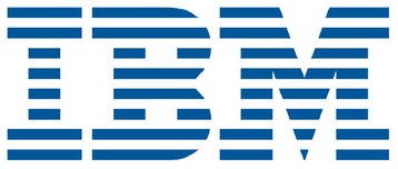
IBM
The brand resembles the monitor rows, but more important is that conceptually
recalls the binary system, that is how the PC works.
Apple
The Apple brand reacts to the old IBM concept with an opposite graphics.
To the IBM monochromes it opposes a lot of colors, to the IBM text it opposes an
image and finally to the white/blue binary pattern it opposes colorful and
without pattern rows.

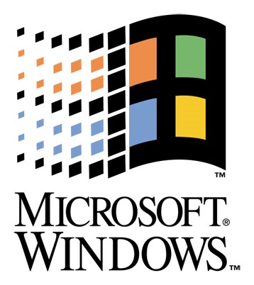
Windows
When at the end arrives Microsoft with its Windows logo, it strategically
collocates itself between the two contenders, bringing order, color continuity
and carrying the Apple creativity to the aseptic PCs world.